Showing posts with label BehindTheEdit. Show all posts

Tuesday, March 27, 2012

Away, away, off into the sky

Okay, no sky besides these pictures, but I will be going away, away off to someplace for awhile. lol. Hope to be back in a few months, but in case you get bored please visit my DeviantArt page below! I have more photos on there than I have posted here (minus some of the really old ones), and I'd love for you to stop by. :-)
http://oneofakindknight.deviantart.com/gallery

This is a silhouette photo of my sister in a jacket looking towards a sunset.There really isn't much to it other than that I told her to look thataway and spread out her arms as shown. I like that pose. :-)

Anyway, here is the original size of that photo, and another set of shots I thought really cool:


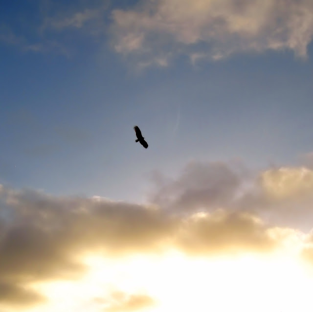
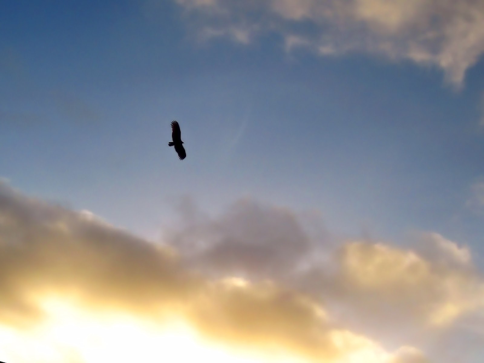
Please view full size! ;-D

Hope you liked them, and see you in a few months!

Monday, February 13, 2012

Harps

Sorry I've been neglecting this blog, our video card went out on our desktop and I wasn't able to access my photos for awhile.
Anyway, here are some of my most recent shots, of a harp.

I was going for a controlled "studio lighting" style for this shot, where it looks like I used a light on the harp in a dark room (though in fact it was just a regular room with a chair in the background, and the lighting actually came from further to the right).

This unique angle was pretty awesome in my opinion, except for the part of the window down in the corner.
Did You Know? An actual harp lesson was going on while I took these photos. ;-D

 Same angle, edited in "duplex" coloring, whatever that is. I love the accents it gives to the mechanisms in the center left of the photo (when viewed full screen).

 Another duplex-colored photo, this time with the harp being played! This photo is actually my favorite I think, though the metal part of it looks much better if the photo is turned sideways:

So that it, and not the hand, is more of the main focal point. But that doesn't make much sense, now does it? Since harps aren't played sideways.

I hope you enjoyed these, and I would love your feedback! :-D

Oh, and make it quick...I've got more photos coming since I am behind. lol.

Monday, January 30, 2012

HDRs and a Tutorial

HDRs! For those new to the concept HDR means High Dynamic Range, which in my mind is a good definition as your main objective is to get a large range of exposures for a scene and put them together to get the best of each one.

This can be accomplished with only a few photos, and here's an example from my PSPX4 program:

Recently, I've been trying my hand at making these things, with a little success, but I know I can probably do better.

Here's my 2nd HDR of some clouds (my first stunk too bad, lol).
I rather like it, actually.

And now for my best one so far (at least in my DeviantART watcher's opinion, as I have more favorites on this thing than any of my other photos EVER).
The downsides are that the color is kind of unnatural, and it could have gone more sunset style than I did, but oh well.
Also, I kinda made this a tutorial, but as I'm no pro it's really just showing what I did. Please click it for Full View or view it on deviantart HERE.
After the processing I actually went and did more contrast and noise removal, as well as a few other minor things I don't remember. XD

I hope you like it!

P.S. These are all edits of the same image to resemble actual seperate exposures on only a slight scale. I haven't gotten the hang of actually taking a bunch of shots with a tripod. It would be too slow with my camera for a sunset.

Thursday, January 19, 2012

The Many Edits of Watered Grass

Should have posted this waaay earlier, 'cause now I've forgotten how I did it. XD Oh well, I'll make a few notes on what I do recall.
The photos are of a small patch of wheat grass near us, and the edits I did aimed toward a darker "movie poster" style of feel, though I can't really place where I've seen a movie poster of this hue specifically...

 Minor edit of the original (contrast, color, clarity).

 Increased contrast and vividity (I also used a foliage vibrancy plug-in, which is why it's so green).

I took the foliage vibrancy back off and increased the colors for this one, probably stuck it through a filter for sunsets, too, then took some of that color and changed it with another plug-in (Or I just used the Sunshine plug-in to do both effects...).

This is even more contrasted and the color brightness and vividity toned down to make a nice shade of forest green.

Added even more contrast and played with another plug-in (Probably "Tonal Contrast").
Notice the shine on the nearest leaf, it doesn't look like a realistic reflection that much. I'll be changing that in the next pics.

This one is much darker and spooky-ish, lol. However, the reflection still isn't quite right.

This is my last edit (besides my Cold one) and the reflection is much better. The darker hue and toned down color makes good focusing for the water droplets. I lightened this one up a bit compared to the last one which was too dark.

I hope you guys liked some fo them! Which where your favorites? Some of the peope who've seen themalready liked the first vivid ones best.

Tuesday, January 10, 2012

Edit Me Challenge

Edit Me Challenge Week 1 (of 2012)!
The photo was tough, and I think I did a decent edit, but I missed it.......
I was going to submit on Saturday, but forgot. :-/

Anyway, here's the original and my edit:

I am not good at fixing lighting on my own photos, let alone this one. Look at that brightness! :o

This edit was the hardest I can recall ever doing. I tried SO hard to bring out the face, but failed (however, I see now that I did better than quite a few submissions, and the only one with a really good face uses CS5. Cheater! lol, jk). My methods here used contrasting, hue change, and a lot of small work you won't notice, hehe.

Main advantages of mine over the others? The sun spots!! I manually removed all of the main ones and de-colored the others, which makes it a very good edit in my opinion.
Main drawback? The face. I couldn't bring it out. the gal with Photoshop even made the eyes an awesome blue when you can't even tell in the original photo! :-P

Anyway, I hope to try again soon, and I would like any and all comments about this edit.

Wednesday, January 4, 2012

Colorful Flame

Have you ever looked at you stove burners in the dark and thought how cool they look? Well, obviously I did anyway, and here's the result, lol. The blue ones are the original color, and the green one is the best quality edit I did. I used PSP X4U's color changer to do the color edits, and the noise removal for sharpening and softening.

 Light Side
The blue really adds to the reflection down on the left corner!

 Dark Side

 Best quality. :-D I shoulda done it yellow so I could say 'neither light side nor dark side' lol. I increased the effect of the contrast with a plug-in. 

 These two are when it was on "low".


Up Next: A ton of edits to a picture of grass! XD

Sunday, July 3, 2011

Behind The Edit - Brown turned Green

I like posting the original pictures to ones I edit out of recognition, lol. Scroll down two posts and compare this original with my edited version!

Doesn't look all too horrible, but it's definitely Brown turned Green, 'eh? XD